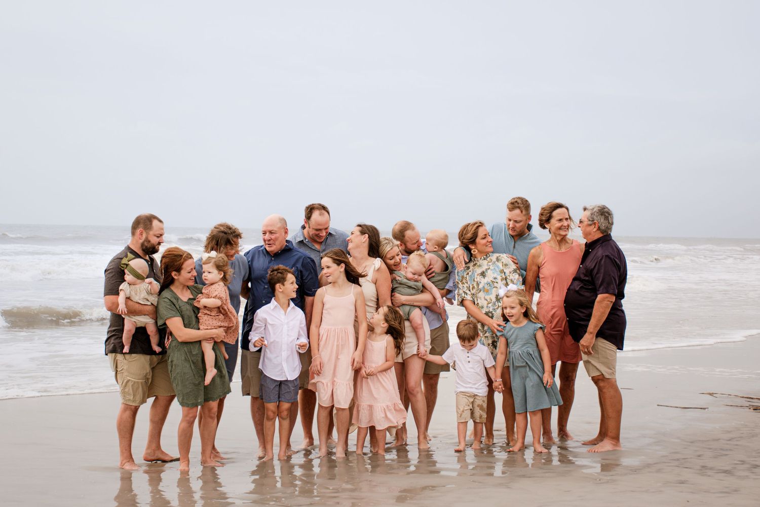
Planning a family photoshoot is exciting—but choosing what to wear? That’s often the part that feels overwhelming. The goal is to create a cohesive, timeless look that reflects your family's personality without everyone wearing the exact same thing. Whether you're prepping for a spring session in a field of flowers or cozy fall portraits under the trees, these styling tips will help you pull together outfits that look effortlessly polished and beautifully connected.
Ideally, you want each family member to wear a different color or shade of the same color you've chosen. However, they should look cohesive and be a similar color palette so they photograph well together, starting with a neutral palette. I also love to use the season you're having your session in, as a guide to the color scheme. Say early in the year spring time is when you want to wear bright, light creams, soft taupes, light blue or light pink, pastel colors. Of course once you get towards the end of the year you want to take advantage of those beautiful bold fall colors like burgundy, olive green, mustard.
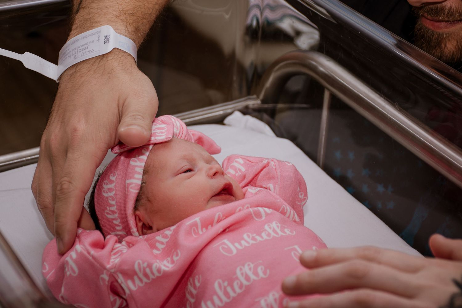
If you’re going for a pop of print in your newborn photoshoot, choose one person to wear the print.
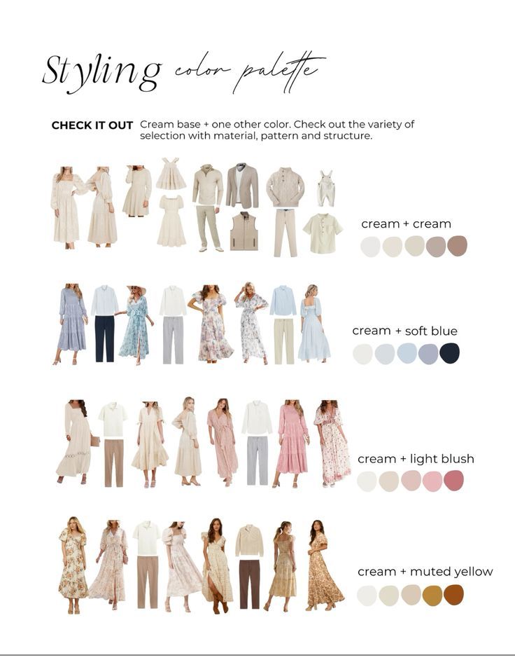
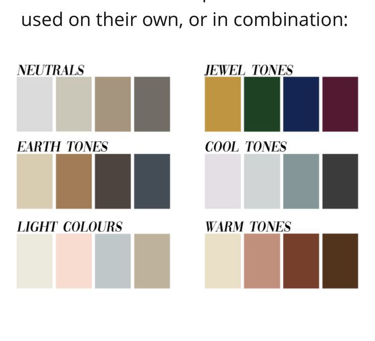
One of the biggest questions families face is: “How do we all look good together without looking like we’re wearing uniforms?” The secret lies in cohesion, not duplication. Here’s how to style your family’s outfits so everyone looks coordinated, comfortable, and camera-ready.
1. Start with a Color Palette
Pick 2–3 main colors and 1–2 neutrals that suit the season and your location. For example:
Fall: Mustard, burgundy, navy + cream or taupe
Spring: Dusty blue, blush pink, sage green + white
Summer: Coral, teal, yellow + light gray
Winter: Forest green, cranberry, charcoal + ivory
2. Mix Textures and Layers
Adding different textures (like denim, knits, lace, corduroy, or linen) brings depth and interest to your look. Layers such as cardigans, vests, or scarves not only look great in photos but allow you to fine-tune outfits day of depending on the weather.
3. Avoid Loud Logos and Busy Patterns
Graphic tees, logos, or bold prints can distract from the overall harmony of your photo. Instead, go for solids, subtle patterns (like florals or plaids), or tone-on-tone prints that fit your palette.
4. Coordinate, Don’t Copy
Gone are the days of everyone in the same white shirt and jeans. Instead:
Vary shades within your palette (e.g., dusty rose, mauve, wine).
Let personalities show—just keep colors and style consistent.
Think balance: If Mom’s wearing a flowy floral dress, dad could wear a solid shirt in one of those floral tones.
5. Plan Around One Outfit First
Start with a standout piece—like Mom’s dress, or a patterned romper for one of the kids—and coordinate the rest of the outfits around it. Pull colors from that one piece to guide your palette.
6. Consider Your Setting
Think about where the photos or event will take place:
Rustic field? Earthy tones like olive, rust, and cream shine.
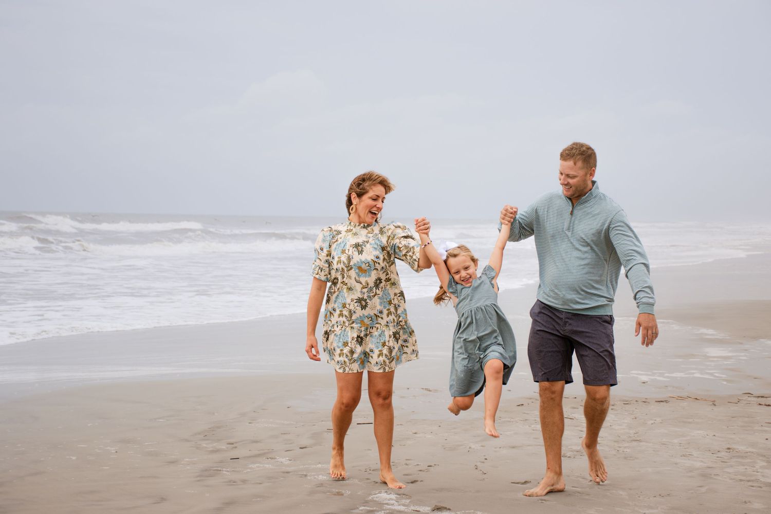
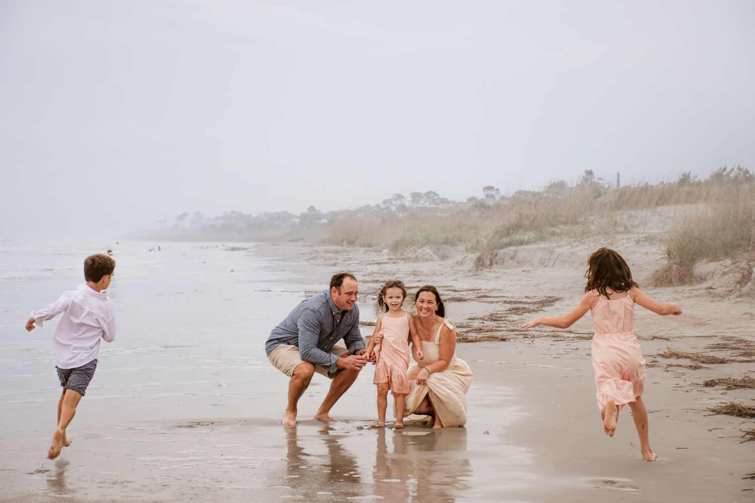
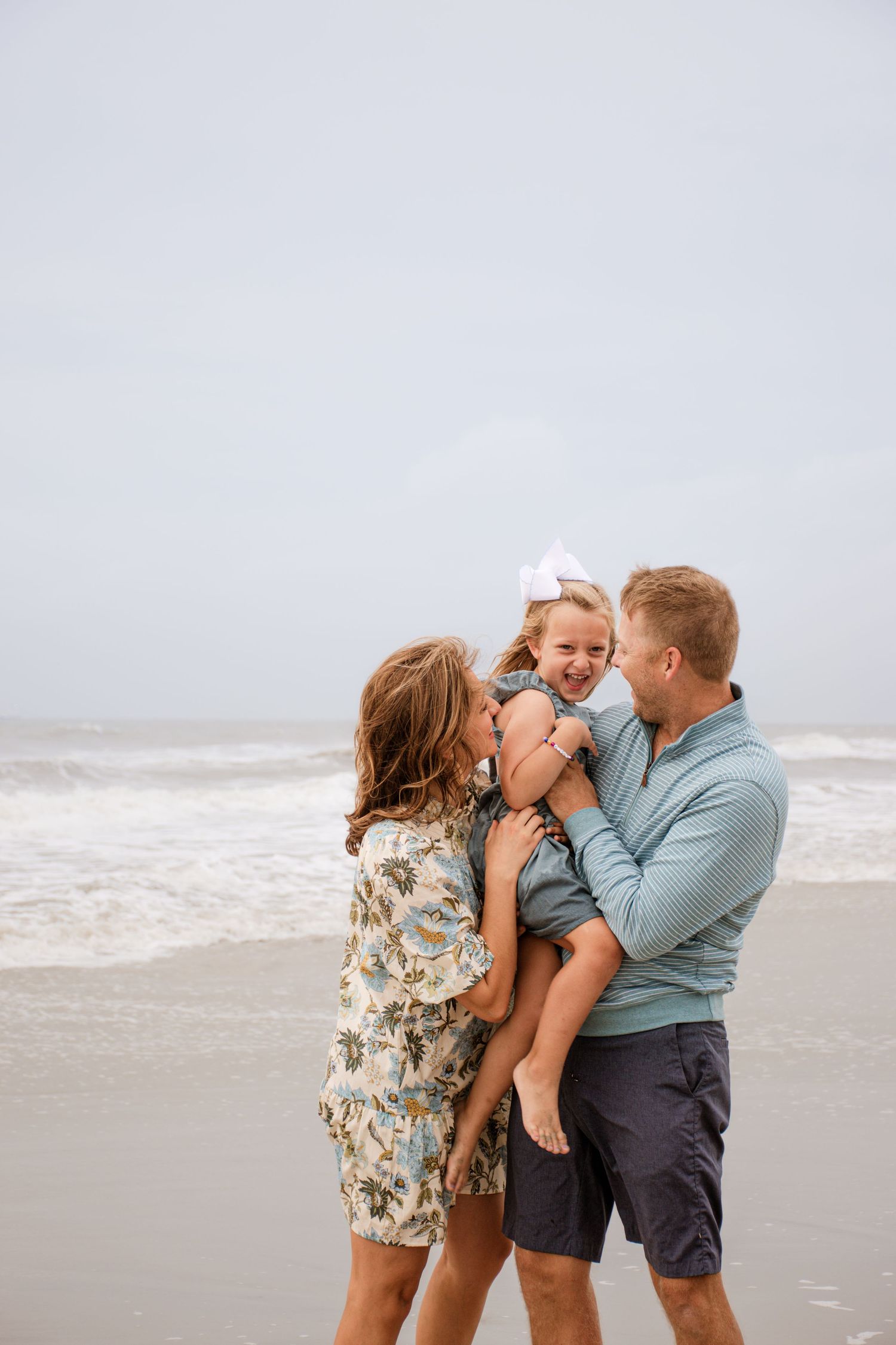
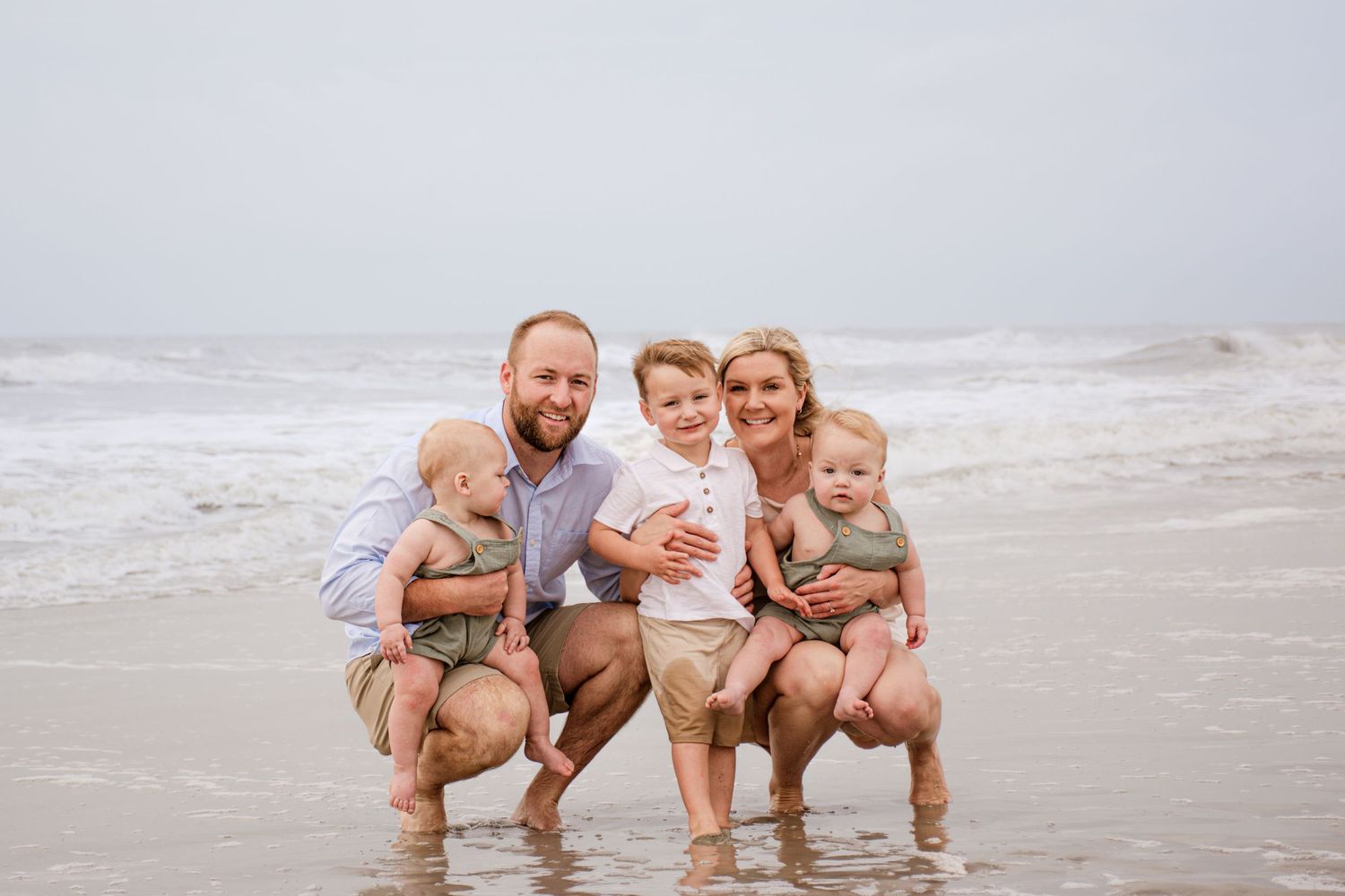
Beach or coast? Soft blues, whites, and sandy neutrals.
Urban scene? Neutrals with bold pops like mustard or navy work well.
7. Don’t Forget the Shoes
Shoes can make or break a look. Stick to clean, neutral footwear—browns, grays, and soft leathers tend to photograph well and keep the focus on faces, not feet.
Final Tip: Lay Everything Out Together
Before the big day, lay all outfits out on a bed or floor to see how they look as a group. This helps spot any color clashes or missing balance before it’s too late.
Cohesive doesn’t mean boring—it means intentional. With a little planning, your family’s outfits can enhance your photos, highlight each person’s personality, and create a timeless look you’ll love for years.
Spring has Sprung
Planning outfits for spring family photos is all about capturing that fresh, light, and joyful feeling of the season. Think blooming flowers, soft natural light, and a backdrop full of color and life. Here's how to make outfit decisions that feel cohesive, timeless, and true to your family's style. Spring family photos are all about capturing warmth, connection, and fresh energy. With just a bit of planning, your outfits can reflect that beautifully.
Would you like a sample spring outfit guide for a family of four or links to shoppable inspiration? Keep scrolling...
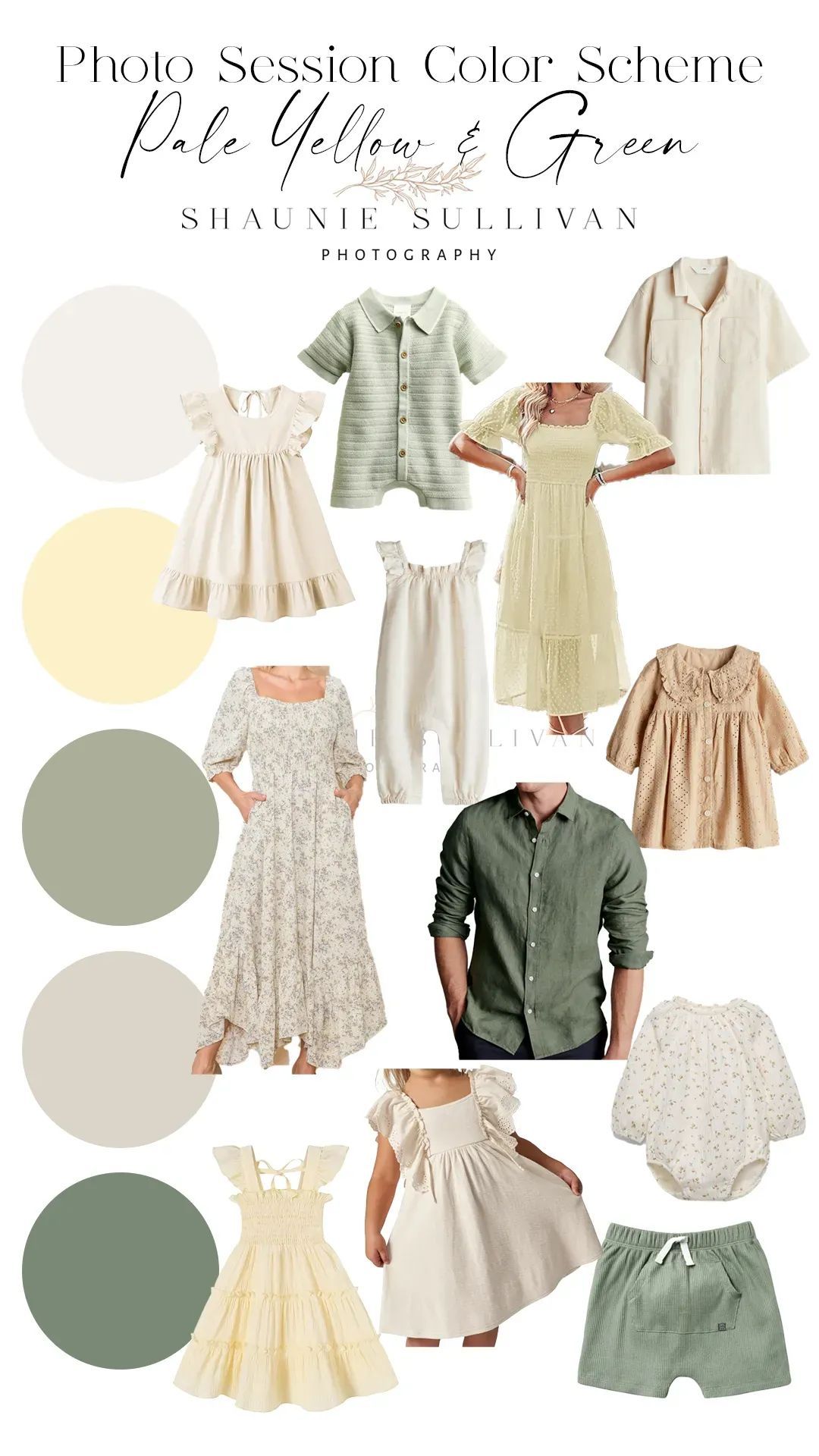
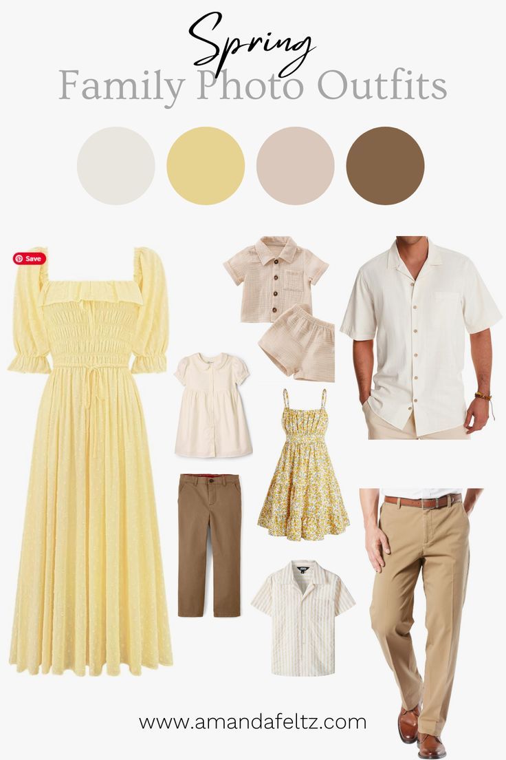
Light and Bright Yellow and Greens
Think of a pale, buttery yellow—this is light and warm, without being too overpowering. It gives the photos a soft, airy feel that complements the spring atmosphere.
These vibrant greens mimic the fresh, new growth of spring and bring an energizing contrast to the yellow. Think of grassy fields or freshly sprouted leaves—this green can give the photos a lively and dynamic feel.
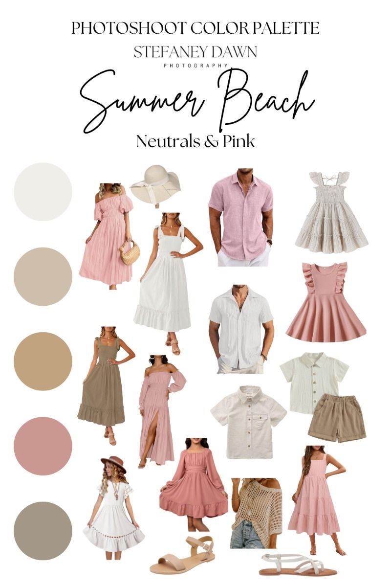
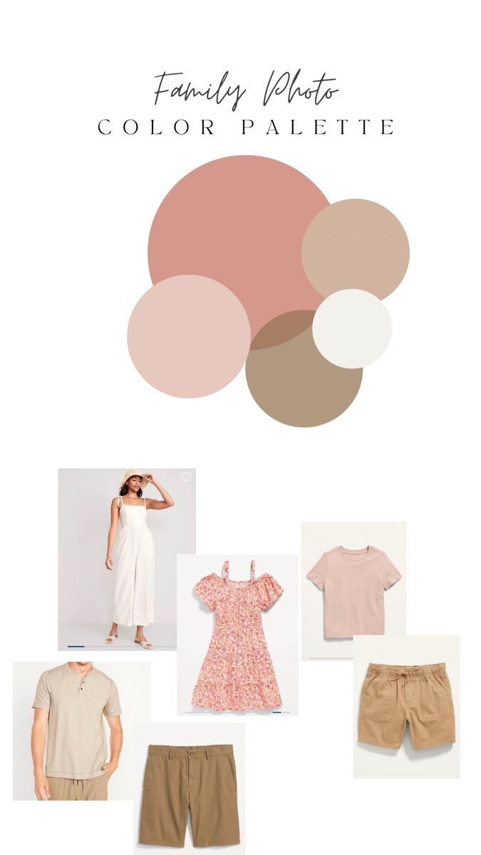
Soft Pink and Muave
These muted, feminine shades evoke a sense of warmth and subtle elegance, making them perfect for creating soft, dreamy photos that feel fresh and intimate. It’s perfect for capturing the softness of spring, offering a gentle warmth that complements natural settings like gardens or fields of flowers. Think of the soft blush of cherry blossoms or a pale rose petal.
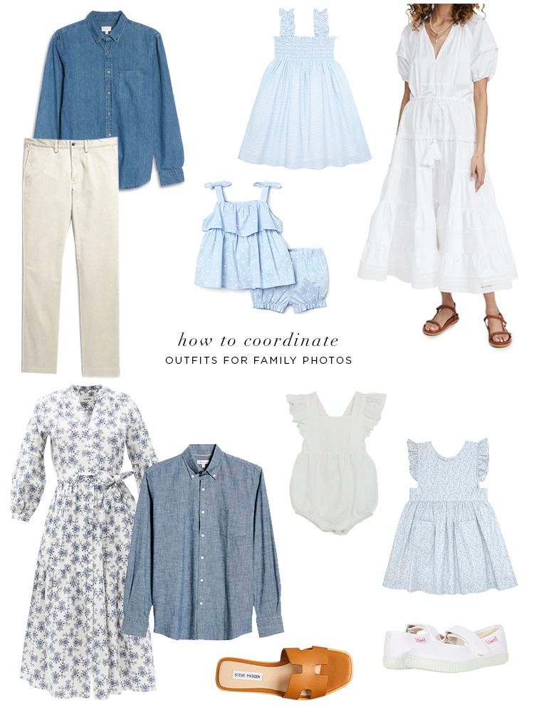
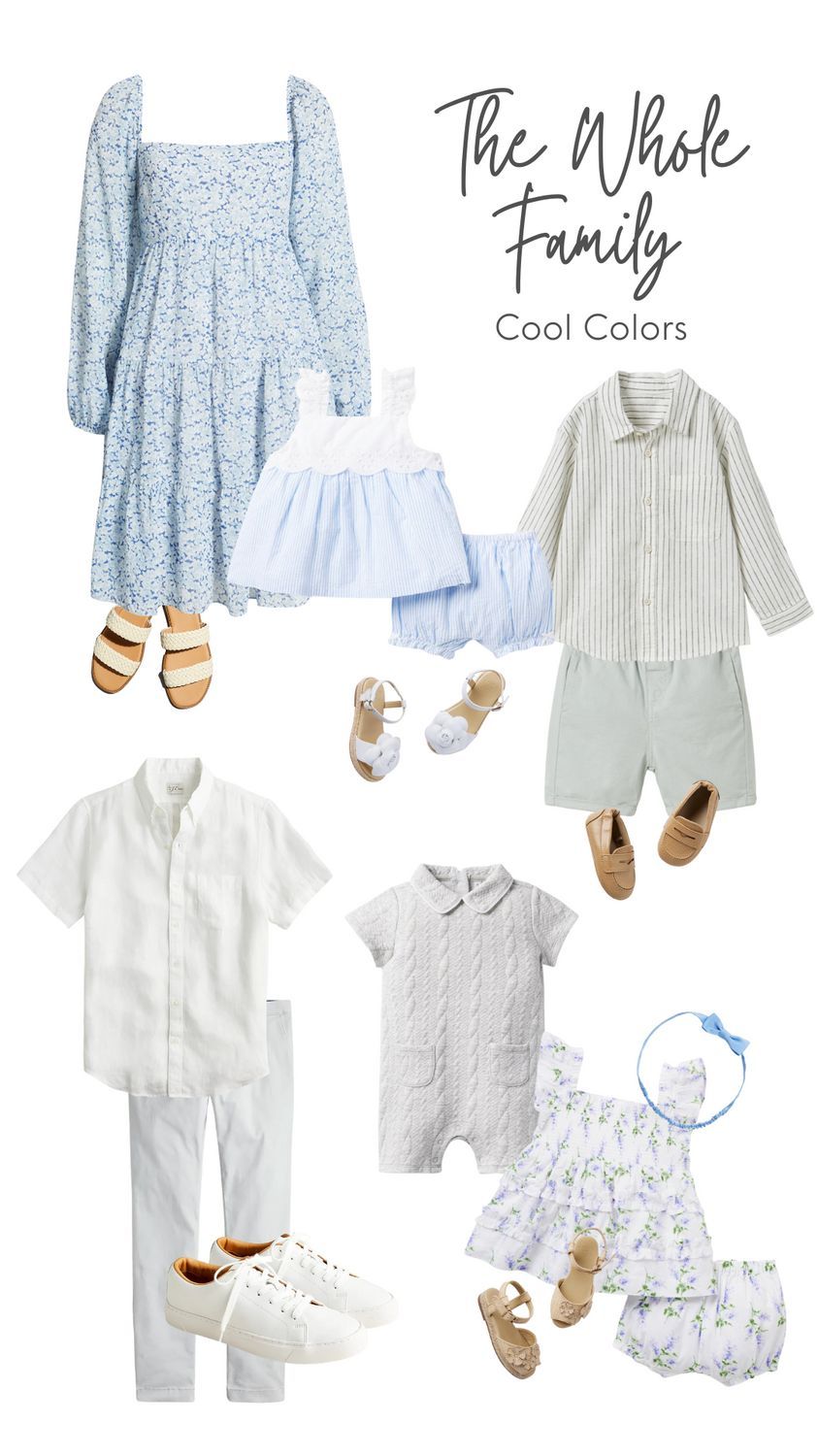
Soft Blues
A blue and white color scheme for spring family photos creates a fresh, timeless, and cohesive look that works beautifully with natural outdoor settings like blooming gardens, open fields, or beaches. These colors reflect the airy, light feel of spring, they look great on all skin tones and ages. The combination pops nicely against green grass, florals, or even a neutral backdrop like a white porch or sand.
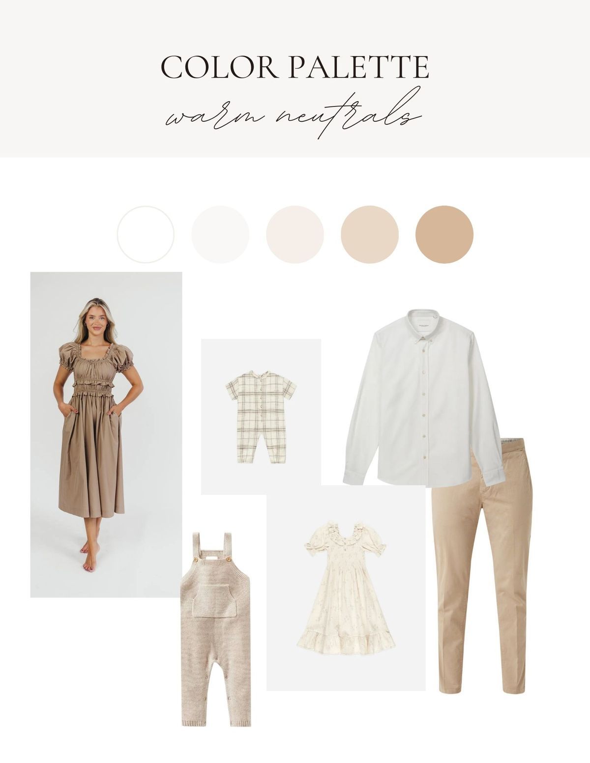
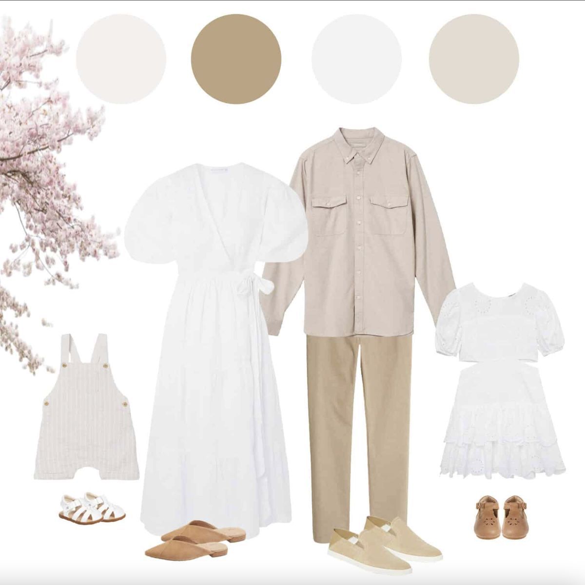
Timeless Creams or All White
A beige and white color scheme for spring family photos offers a soft, elegant, and earthy aesthetic that feels warm, organic, and effortlessly timeless. It's ideal for creating a relaxed, cohesive look, especially in natural settings like fields, beaches, or gardens. Reflects the light, warmth, and softness of spring without being overly bright while allowing the focus to stay on the faces and emotions, rather than the clothing.
Autumn Looks Good on You
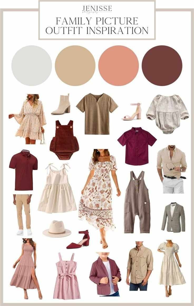
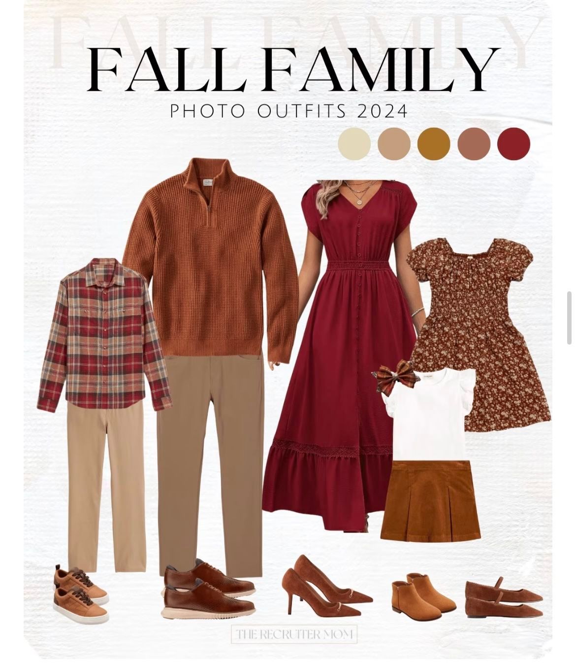
When choosing outfits for fall family photos, bold, dark fall colors can make a stunning impact. Rich tones like deep burgundy, forest green, navy, mustard, and burnt orange complement the warm, earthy backdrop of autumn leaves and golden hour light beautifully. These shades not only add depth and elegance to the photos, but they also help each family member stand out individually while maintaining a cohesive look as a group. Darker hues tend to photograph well, creating a polished, timeless feel that contrasts beautifully against the natural light and rustic textures of the season. Opting for layers like scarves, cardigans, or textured knits in these bold tones can also add dimension and warmth to your images, making your fall photos feel both stylish and seasonally rich.
Bold in Burgundy
A burgundy color scheme for fall family photos creates a warm, rich, and elegant aesthetic that perfectly captures the essence of the season. Burgundy, a deep red wine hue, evokes the changing leaves and cozy textures of fall while adding a touch of sophistication to your photos.It pops beautifully against natural backdrops like golden leaves, pumpkin patches, or woodland settings.
Olive this Look
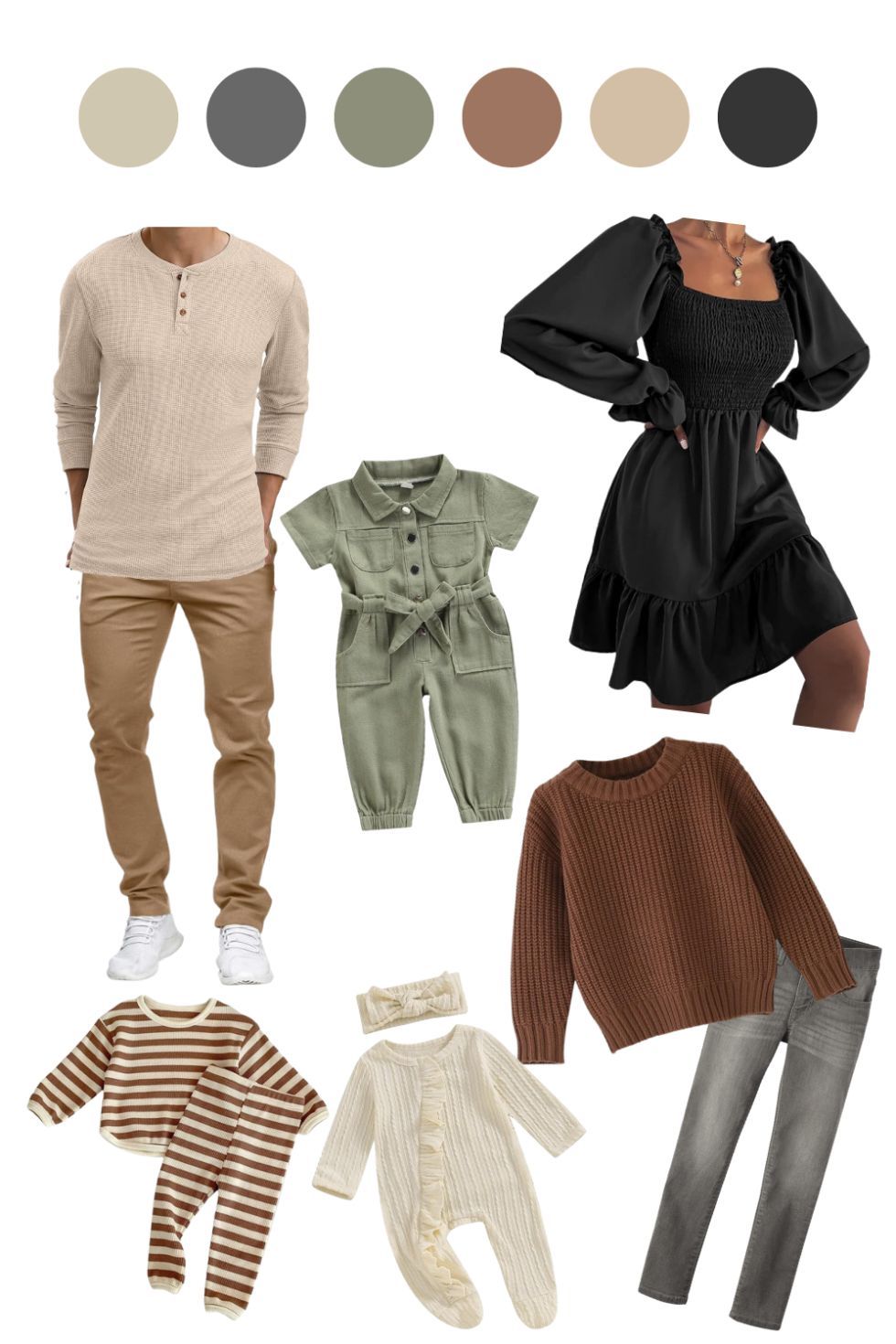
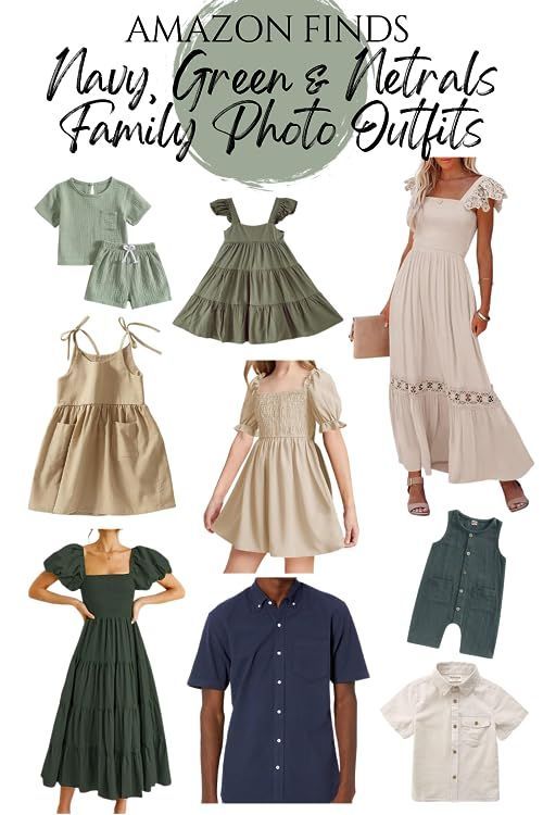
This palette blends the richness of fall with a soft, timeless touch, perfect for capturing natural warmth and connection. Olive green reflects the grounding tones of autumn foliage and forests, while cream adds lightness and warmth, echoing the soft glow of fall sunlight.
Add in tan, rust, or gold accents for dimension.
Use textures like cable-knit sweaters, corduroy, and linen to add depth without loud patterns.
Brown is the New Black
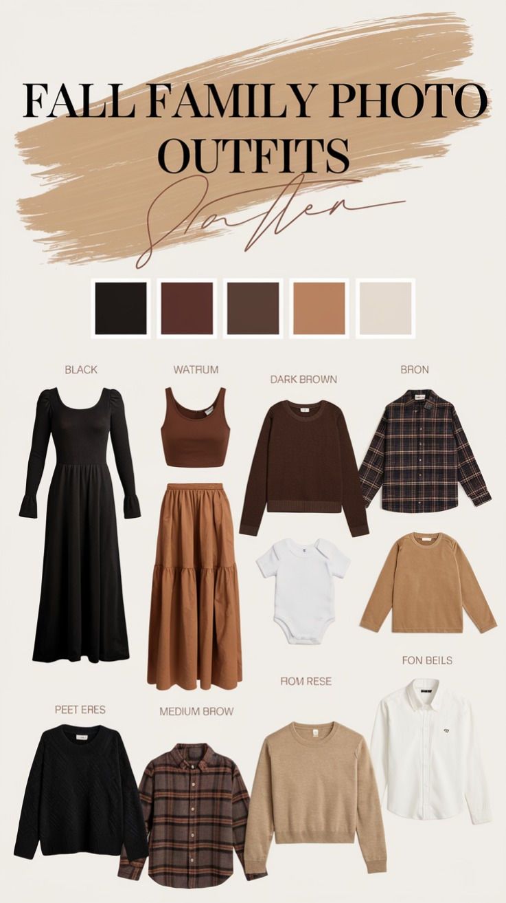
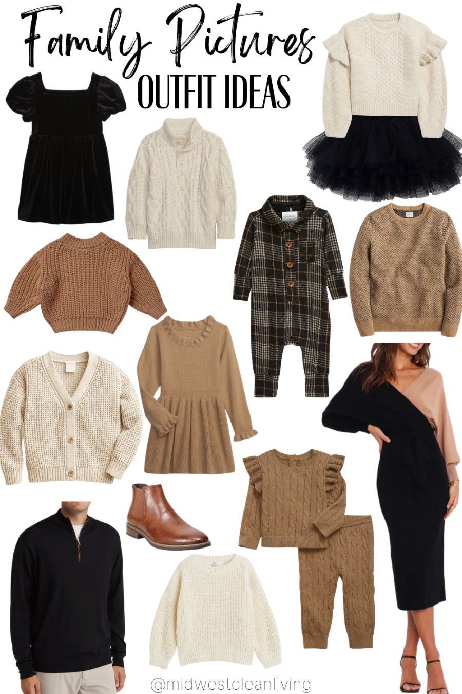
A bold, modern, and effortlessly stylish aesthetic. This combination offers depth and sophistication while still embracing the warmth and texture of the fall season. Deep browns echo the richness of autumn—think tree bark, leather, and soil—while black adds polish and contrast.
Use black as a base (jeans, boots, jackets), and break it up with chocolate, espresso, or chestnut brown. Touches of cream, camel, or taupe accessories can brighten the palette just enough without taking away the moodiness.
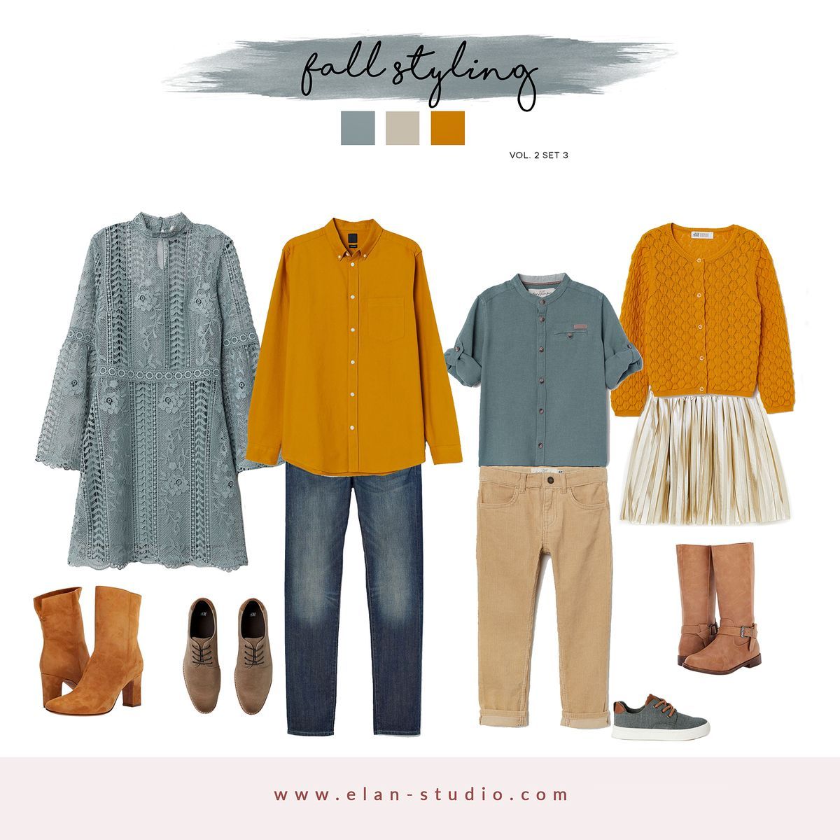
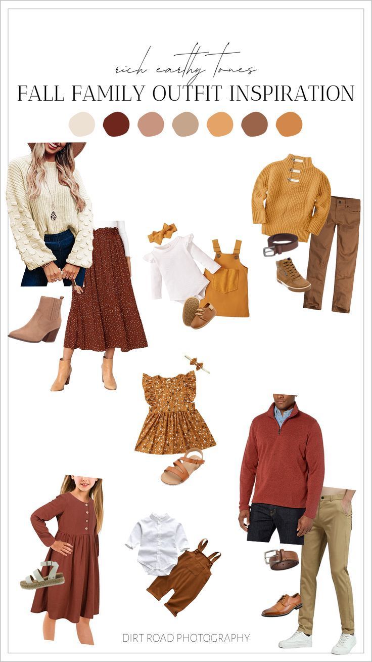
Mustard Made for Fall
Mustard brings warmth and a cheerful, golden tone reminiscent of fall leaves and harvest time.
Burgundy adds a rich, deep, and slightly dramatic touch, evoking the beauty of autumn berries and fallen leaves.
Blue offers a cool contrast to the warmth of mustard and burgundy, while still being deep enough to maintain the fall vibe. It can also act as a grounding color, balancing the other tones.
Use mustard and burgundy for the main clothing items (sweaters, scarves, dresses) and let blue accent through denim, jackets, or accessories to provide visual balance.
Styling cohesive family outfits doesn’t have to be stressful or overly matchy—it’s all about creating visual harmony while letting each person’s style and personality shine. By choosing a thoughtful color palette, mixing textures, and coordinating rather than duplicating looks, your family can show up feeling confident, connected, and camera-ready. Whether you're dressing for a fall photo session or a holiday gathering, a little planning goes a long way in making your memories both beautiful and timeless.
Ready to pull it all together? Start with one outfit you love, build around it, and most importantly—have fun with it!